
-
Academic Task 1 (Line Graph)
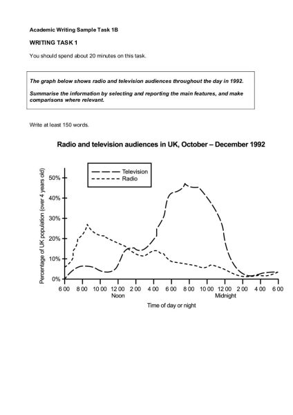
Posted by Isha Singha on November 14, 2022 at 8:56 AMThe graph below shows radio and television audiences throughout the day in 1992.
Summarise the information by selecting and reporting the main features, and make
comparisons where relevant.to rise
to increase
to surge
to grow
to peak
Large rises:
to rocket
to soar
to leap (->leapt)
to fall
to decrease
to decline
to dip
to dive
to plunge
Large falls:
to plummet
ryan replied 1 year, 7 months ago 7 Members · 6 Replies -
6 Replies
-

The graph illustrates the percentage of audiences for radio and television throughout the day in the winter of 1992.<div> Overall, it can be seen that people tend to listen to the radio more in the morning whereas the peak viewership for television is during evening time. Also, there is much more audience for television compared to the radio.</div><div> Firstly, starting with the radio, at 6:00 AM the audience for the radio is (nearly 6-7%) more than that of television (0%). The number of audience keeps increasing till it reaches it’s peak of nearly 26-27% at 8:30 AM approximately. After that, till the next morning, there is a steady decline in the number of listeners of radio except 2 rises(nearly at 4:00 PM and 10:00 PM).</div><div> Moving on to television, the audience for television is 0% at 6 in the morning, but it shows growth up to nearly 20% till 4:00 PM with few ups and downs. After 4:00 PM, the number of television viewers surges, reaching it’s peak of nearly 45% at 8:00 PM. Soon after at 9:00 PM, the audience for television starts plummeting till it gets to nearly 0% at 2:00 AM the next day and afterwards, it continues to be in the nearby range for next 4 hours.</div>
-
The line graph illustrates the percentage of people listening to radio and watching television in United Kingdom from October to December of 1992.
Overall, the graph evidently reports that there has been a large surge in percentage of population who opt for watching television over listening to radio at night, however the percentage of radio listeners surpasses television viewers at dawn.
In the initial phase of the day, there is a sharp increase in the percentage of radio listeners and the value skyrockets to about 30% between 8:00 A.M and 10:00 A.M. Despite the initial leap, there has been a gradual plummet in the listener’s percentage thereafter. It has a slight increase in the audience’s percentage for about 15% in the evening for about an hour from 4 P.M.
The graph displays that there are less than 10% of the active viewers of television until about 12 in the noon. But there has been a gradual increase in the percentage of viewers starting from 3:00 P.M in the afternoon, and the value leaps to almost 50% of the active viewers in the time frame between 6:00 P.M to 8:00 P.M. Post to which the viewer’s rate tend to plunge gradually and evenly until 2 at midnight.
-
A Comparison between the TV viewing population and the Radio listeners audiences in United kingdom throughout the day in 1992 is drawn in the given line graph.
In general, the graph reports that there has been a large surge in population percentage who opt for watching television over listening the radio at night.
Initially, the radio listeners are sharply increased and values to rockets about 30% between 8am to 10am. Despite the initial leap, there has been a gradual plummet in the listeners percentage thereafter. It has slightly increase in the audience’s percentage for about15% in the evening for about an hour from 4pm.
The graph shows that there are less than 10% of the viewers of television until 12 in the noon. But, there has been a gradual increase in the percentage of viewers starting from 3PM in the afternoon, and the value leaps to almost 50% of the viewers in the time between 6PM to 8PM. Post to which the viewer’s rate tend to plunge gradually and evenly until 2 at midnight.
-
The line graph illustrates the percentage of UK population using radio and television throughout the day from October to December in 1992.
Overall, the percentage of UK population using Radio decreased with day while percentage of UK population using Television increased with day.
According to line graph, in the Morning around 5 O’ Clock people start using Radio then it experienced a rapid surge to 28% at 9 O’ Clock but it gradually decrease with the Period .
During Morning, the curve for Percentage of Television audience experienced fluctuations but a after midday it rose sharply to almost more than 45% however, it dramatically decline to 2% after midnight.
This line graph described that in UK, Percentage of Television audience is more than the Radio audience.
-
The line graph illustrates the crowd of various means of entertainment such as radio and television in UK, October to December 1992. Units are measured in percentage (%).
People watching TV increase gradually from 8am to less than 10%, while decreasing slightly by 10.30am. However, the traffic surges throughout the day upto 50% and shows an immediate fall at midnight dipping to just above 0% and remains almost constant till the end of the day.
Radio audience experiences a rise to just under 10% to 30% between 8 to 10am. Although, the crowd keeps declining by 10am to 2pm. Furthermore, radio traffickers peaks slightly at 4pm, however plummeting 6pm onwards to just above 0% by the end of midnight.
-
The line graph depicts a comparison between the percentage of UK television and radio audiences above 4 years old throughout the day in 1992.
Overall, it could be devised from the graph that popularity of television is high compared to that of radio. Though, both percentage of audiences of television and radio almost starts and ends at nearly the same point; which is highly expected. Both have different peak times.
Furthermore, the percentage of television audiences is at 0% during 6.00 am and it increases fluctuatingly to reach its peak value at 8.00 pm having almost 50% of the UK population. Suddenly, it plummets down steadily to nearly 5% at 2.00 am midnight. After that, it doesn’t decrease to 0% rather fiddles around an approximate of 7% till 6.00 am.
In the case of percentage of radio audiences, the diagram showed steady increase from nearly 5% at 6.00 am to approx. 28% at 8.00 am. Moreover, the graph shows gradual decline with slight variations till 2.00 am midnight. Likewise, that of the television, the graph then maintains almost a constant value around 7% till 6.00am.
Log in to reply.